

You must log in or register to comment.
deleted by creator
Yeah, I think there are a few adjustments I should make. Thanks for pointing that out. How’s this?

I honestly like that it looks a little awkward!
deleted by creator
deleted by creator
What do you think about this? I know I won’t get it to be perfect but your tips are helping.

deleted by creator
Thanks! And thanks for all your advice too!
I like it visually, but it looks a little sad or stressed out to me. Something more positive would be appreciated.
Yeah, I can see what you mean. Thanks for the advice! How’s this? Any other tips?

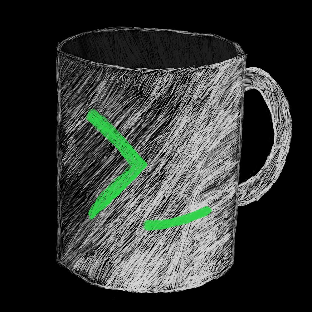
Meanwhile my logo is just this lol
That’s pretty cute
Thank you! I made it a couple of days ago because the icon pack I’m using didn’t have a supported icon and it drove me crazy
Has charm in it’s own way 👍.
It looks like it needs a hug
⊂(・﹏・⊂)
I love the colors though! It really pops out and is pleasant to look at!
Love it
Thank you!
Looks nice, “everything reminds me of apollo” 😅 but in a good way.
It’s nice art… for anything mass adoption, I always recommend flatter/less detail. No one like FB Buck Alegria, but man does it work for global tech deployments.
This one’s my favourite!
deleted by creator
Not. Fan of the color pallete tbh
How do I access wefwef again?
You can access it at wefwef.app.
i think it would look better if there was less shadow on the face


