

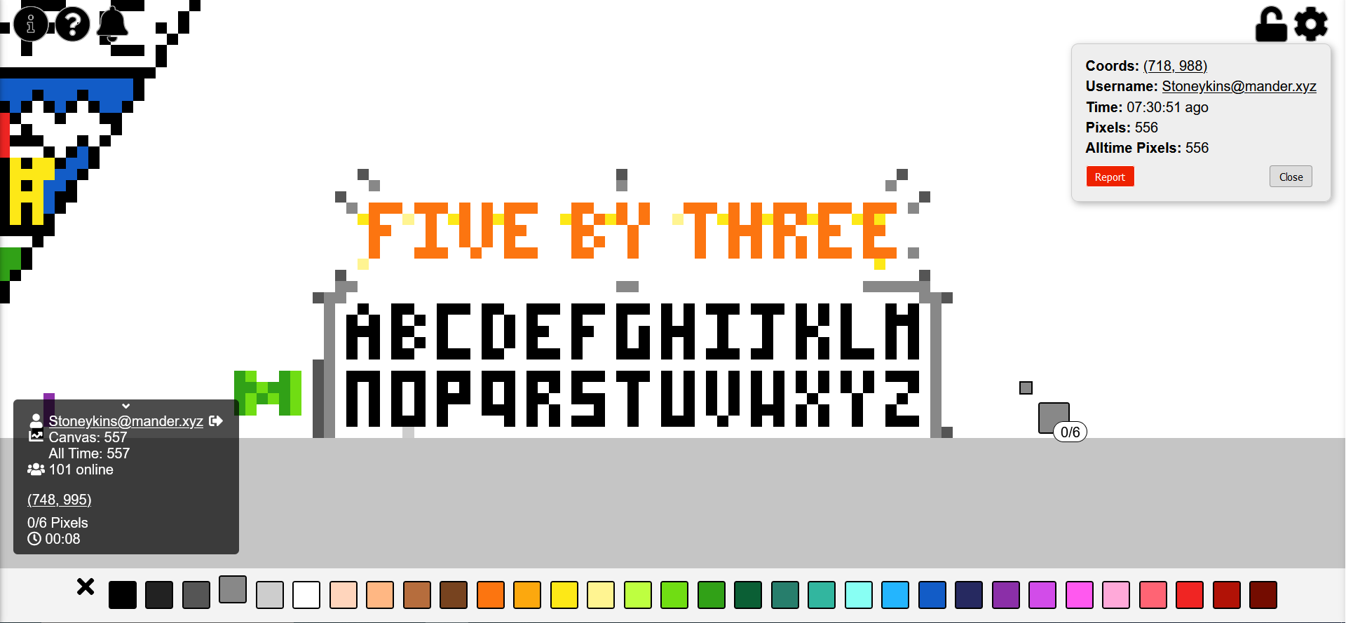
I’ve been doing this. Now everyone will know the superior small block letter font in which every letter fits into 5 by 3 pixels. I challenge you to show me a better small block letter font in which every letter fits into 5 by 3 pixels!
also I’m still trying to make it look nicer but it was taking a while so I figured I should explain why I made this
shoutout to [email protected] I like your green M
update: not done yet, but I wanted to ask people’s opinions on the J. any consensus on which is better?

The J above the OR seems better
people do seem to prefer that one. I’ll probably change it after I get the color stuff done, to give more time for people to weigh in.
Oh, hey neighbour! I’m right next to you (the DAFC badge - which doesn’t adhere to 5x3, I know)
I like the J with the bar over it more than the other one, but both work.
I won’t hold your font choices against you.
…much.
:-)
Just spotted this, which I quite like - the person doing it is using 4x3, which still works, although it does mean the M and H are the same, and no space at the top of E or F
What about small letters?
DEBATABLE THAT THEY EVEN EXIST. I’M NOT SURE I’VE EVER EVEN SPOKEN TO A LOWERCASE LETTER BEFORE IN MY ENTIRE LIFE!
(actually I just didn’t want to monopolize TOO much space on my personal random font thing. if you wanna make a version for small letters, I encourage it.)
